
A new design for SMB mobile sites
Beyond Private Label has designed a more user friendly experience for local media designing SMB websites.
For local media companies building responsive websites for SMB’s, Beyond Private Label has come up with a better mobile design. Their new product, called a mobile effective site, was launched in early January.
It’s worth learning from for teams that work with web dev for SMB’s, as the new mobile sites provide some basic improvements over the traditional responsive design.
First, as everyone knows by now, a non-responsive website is a terrible user experience on a cell phone:
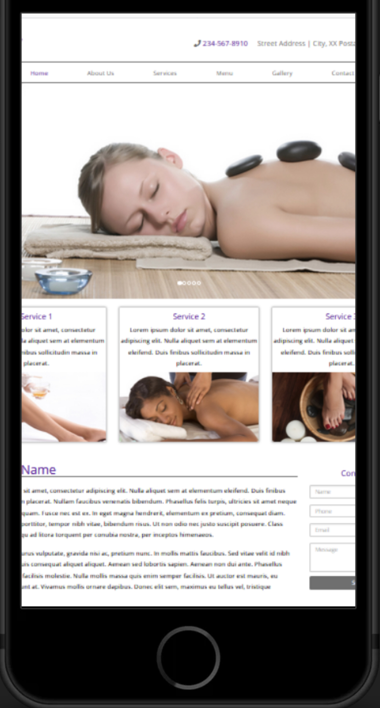
Traditional responsive sites verticalize the web page in the following structure:
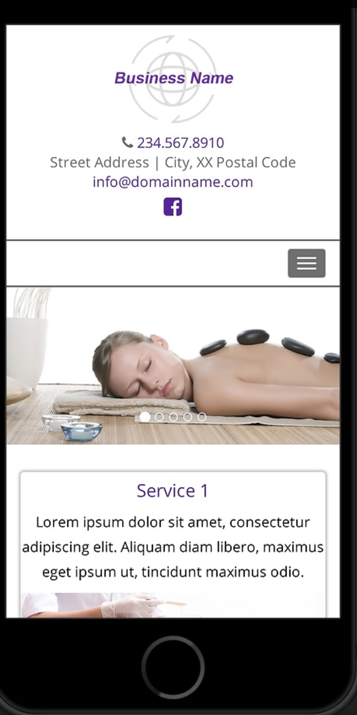
The team at Beyond Private Label thought this model still had user experience issues, including whether the contact information is actionable, how it disappears as the user navigates, and how “learn more” options are buried under the “hamburger” - the three lines indicating additional navigation options.
Here is what their solution looks like:
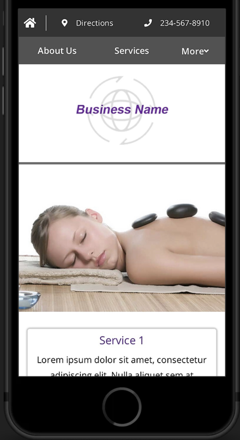
While it does not look dramatically different, the mobile effective site has enhanced functionality and placement:
-
The key information - phone numbers and directions “stay on top” so the customer can take action at any time while they are perusing other information on the site.
“The biggest problem [with responsive sites] is that when you scroll down your phone number goes away. We always give the phone, directions and learn more at the top of the site,” said Kevin Wendt, Business Development Manager at Beyond Private Label.
-
Three key elements, click to call, map a location or learn more are always activated. A simple responsive design does not necessarily mean that the customer can click to call or map the location from their phone.
-
A legible navigation bar has replaced the standard three line icon, exposing more options.
“Traditionally on a responsive site, you click the three lines, the hamburger we call it. Here you can see all ‘learn more’ options in a real nav bar that stays at the top,” he said.
Wendt said the improvements are becoming a key selling tool for media reps, who can now show a unique mobile design with each website that increases mobile conversions - and a clear competitive advantage over other local web developers.
Since the technology has only been in use for 30 days as of this writing, it is too soon to track statistics, but Wendt estimates a 10x improvement in User Experience, and that results should be showing up over the summer.
“Hundreds of sites now have this technology, soon to be thousands,” Wendt said.
Keywords
Beyond Private Label, Web Development, Local Media, SMB, User Experience, Mobile Web, Mobile,


